
Posted by ImproveCareNow™ on January 29, 2013
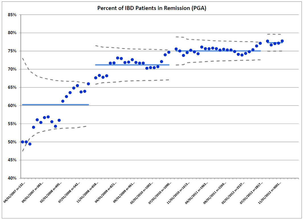
A control chart allows us to detect when there has been a significant change—a real improvement.
This graph shows that the remission rate has been increasing steadily since February 2012, and in August 2012 the remission rate crossed the dotted line (the upper control limit), indicating that a real improvement had occurred. It also shows that the average remission rate has increased from 60% in 2007, to 71% in 2008, to 75% in 2010, and to 77% in 2012. The ImproveCareNow Network will continue to apply the Model for Improvement and use QI tools to improve the remission rate to 80% or more.